Monday, December 14, 2009

People As We Know It: Commodification in the Land of the Beautiful


April 2002

In the 90s and 2000s, People became the magazine we all know and love (to hate).

On it covers, there are the beautiful people, and usually more than one of them. People uses multiple frames, candid pictures, and collage effects to portray an overwhelming power of Hollywood and the famous in America. Sometimes, a picture can be recycled two or three times to the point where a star's image (or at least, People's take on it) is branded into our subconscious.

Perhaps the most memorable pictures that show up on the covers of People Magazine are the Oscar photos. They tell the story we're used to by now. This is American beauty at its height. Stars gather in their pretty dresses and bright smiles to pose for the camera and make a lasting impression on their audience. So when you get on the cover (which are almost always women), you have the opportunity to control your image in a way that every starlet wants to be seen. Images of refined elegance, stunning beauty, and genuine emotion pervade the pages of People's Oscar issues in a way that goes right back to that very first issue: the celebrity for sale as well the hearts of the women they touch.


April 1997

1970's women's freedom!


In the mid to late 60’s women realized that now they had the qualifications for proper jobs , but they were not being treated the same way. The 70’s were about “ equal pay for equal work” and women often attacked their bosses and fellow employers for sex discrimination. The early 70s was when the hippie period was at its prime, which represented equal rights for women and men, and women’s sexual and mental liberation. Many books were being published about the importance of women’s rights, another words the feminist movement became prominent in this decade. Different publications made a larger audience aware of the unequal treatment of women in the workforce. This was also the decade when the congress adopted the Equal Rights Amendment, which meant women had a right to an abortion and it was a private issue between the patient and the doctor. This was the most important decade for women’s suffrage and women had made a huge jump in finally being seen on an equal plane as men and having the same opportunities. Of course sex discrimination still existed and is even present today. Even advertising took hold of this new female freedom by selling products, which appealed to women wanting to demonstrate their independence. Cigarette companies would show images of women from the turn of the century getting arrested for smoking. They would use this to demonstrate how now women could perform this stereotypical masculine act and thus be as free as a man.

Seventeen magazine covers were filled with headlines about getting involved and contributing to society as free and active members. This cover presents an image of a girl who for the first time appears to be a bit younger then past images, and she is standing in a confident way. Her stance is empowering to see, much like the “Rosie The Riveter” image. Her stance doesn’t represent a meek subservient women anymore. The headlines are about jobs, how to volunteer with an organization concerning the environment, and other ways to save one’s money. It seems as though these women once again have full control of their lives, and these headlines demonstrate this. She is also wearing something that was quite different then prior eras , almost like a native american/ cowboy look. This can be seen much like punk today, a counter hegemonic behavior. The female will not be told what to wear she will dress, how ever she please even if it is different then everyone else. This cover reads “ New Beauty, Breakthrough CHANGE!”. Change is exactly what occurred and this was reflected in the fashion and even the makeup. Young girls wanted makeup and clothing to reflect their freedom. Once again the image isn’t about a scene representing a lifestyle, but a perfect looking girl posing for the camera. She has the unattainable beauty and thin physique, which we have all adopted as the perfect look. The importance of this cover is totally about the use of the girl’s looks to cause girls to idealize her not for her position in society, but more for her appearance. Therefore this paradox existed between representing female freedom and a whole new set of problems for young girls, as more and more teen magazine covers appeared just like this one.


http://www.seventeen.com/fun-stuff/special/65th-anniversary-cover-archive

http://www.enotes.com/1970-lifestyles-social-trends-american-decades/womens-liberation

1960's independence= changing fashion=shallow headlines


During the 1960’s, women’s roles started to change again as many women became upset with their oppressive lifestyles. They realized the suburban housewife image was not the route to happiness. Women wanted to leave the house and work . Divorce rates increased during the end of the 1950’s and throughout the 1960s , because of the way women were being oppressed causing them to feel isolated. Since women often got married at a very young age some went back to school.

While women understood the value of bringing up their children, housework wasn’t something that was rewarding. They had been taught that housekeeping and making the husband and kids happy was the most important thing they could do, but this was not enough for them. The media continued to try and uphold this same suburban, housewife image through the end of the 1950s and early 60s . The media started criticizing women who wanted to do more then housekeeping and child bearing. As one article said” They should use [their minds’ in every conceivable way.. so long as their primary focus of interest and activity is the home” and that “if they are truly feminine women, with truly feminine attitudes, they will.. accept their wifely functions with good humor and pleasure”(encyclopedia). The media tried to make it seem as though these women became a threat to their family and the well being of the entire country.

The media was attempting to promote the ideology that the US government wanted during this time. In the book “Practices of Looking” it states: “ Dependence on markets and government support makes it difficult if not impossible for media corporations to play the role of watchdog when it comes to reporting issues that involve potential infringements upon rights and freedoms by those who determine the financial stability of the corporation”(255). The media, including Seventeen magazine, is mainly owned by powerful men who are also connected to government officials who did not want to see a change in roles after life had finally returned to what they saw as normal and perhaps steady.

While this may have been, the case the demands of family life including domestic work and the man’s work all created stress that had to be dealt with in order to stop the family lives from continuing to fall apart. Men and women accepted changing roles in society. Since women stayed at home doing domestic work from cooking to mowing the grass, her jobs included some more commonly masculine tasks. Men sometimes drove the kids to school or bought groceries. The line between male and female jobs began to blur. While women and girls began to be taken seriously in school and girls were able to see a future that went beyond simply getting married and having kids, they faced more problems entering the work force. The cover of these magazines in the 1960s usually mentioned something about jobs or college, like how to make money in the summer or articles about picking the right college. Although it seemed as though these covers began to digress in terms of the female images they promoted.

In the 1960s women started to gain some more freedom , and the fashion changed along with this. As women no longer had to appear as perfect statues, taking care of the home and looking good for her husband, clothing demonstrated this new freedom and independence women started to gain. This meant shorter and tighter dresses, which meant thinner models. This perpetuated young girls to think more about their weight and appearance . More headlines started to appear on the magazine cover , most of them concerning weight, clothing, and guys.

It seemed as though the digression of this magazine began and instead of promoting active citizens and treating girls as and intelligent demographic the covers seemed to encourage girls to solely think about their appearance and how to get a guy. Girls started to look up to the women on the covers, because of the way they looked rather then their contributions to society.

Although there were exceptions and the magazine still held to their original purpose, but more and more it began to change. This cover happens to be one of the more positive covers for young girls. More headlines exist on the cover , but many of them are about ways to participate in society whether by going to college or voting . The cover still retains its artistic side by using a photo, which is beautiful and stands out as a piece of artwork. It is not just an airbrushed portrait of some model or actress. Although it no longer presents women in a scene that reflects a lifestyle, it is just a photograph of a girl dressed well and looking pretty. The one headline that’s says “Help! I hate my nose” is an example of what a lot of the covers began to look like in the 60s, while still incorporating the freedom women started to obtain. We may take advantage of voting at 18 or going to college, but these were very hot topics at a time when women were finally being encouraged to move ahead in society through education, work, and their political voice.

Fashionable Foundations and the Feel Good/Feel Bad Story

Although People may be a gossip magazine, it has not lost its roots in fashion and what fashion can say about the people who use it.

On June 20, 1977, People published an article following the story of Roy Halston Frowick aka Halston, fashion designer to the stars. He is depicted with Liza Minnelli and Elisabeth Taylor as a man on top of his game and of the beauty industry. No scandalous comments for the man that was making some of America's starlets into fashion icons.


Halston 1977

Yet 13 years later, an almost identical picture shows up in an April 1990 edition with an entirely different spin. It is a shocking transformation: People will do an in depth story on the fall of Halston from fashion genius to... AIDS victim.

It is interesting the way People reappropriates the positionality of a victim of this disease. Halston is immediately othered. The headline of the story reads, "Like Fitzgerald's Gatsby, He Was a Mysterious Midwesterner Who Shone Brightest at Night. Then the Parties Stopped". Returning to this idea of a quintessential Americanness (one of high modernism and inaccessibility), People once again proceeds to make the reader pity in light of his public scandal. They play up his glamorous lifestyle then show how certain lifestyle choices caused him to die tragically ill. Of course, Halston was 57 at the time of his death. The choice to picture him as he was emphasizes the significance of his demise and causes the female reader to identify with a gay male counterpart. You can see in Liza and Liz Taylor's body positions that they are looking up to him in admiration as we look down on him in shame.


I


Halston 1990

It may be exploitative of People to talk about the death of a star, but you will notice that death and anticipation of death, especially from AIDS became a big a story in the 80s. With the murder ans assassination attempts on John Lennon and Ronald Reagan shocking alarming the nation, it was important for People to take up some of this conversation and place it in the laps of women across the US.

One way to do that was to hit them where it hurts: with another ideal image of American beauty.

Alison Gertz, a society girl from the Upper East Side, contracted HIV on her first sexual encounter and was given the opportunity (unlike many minority groups throughout New York and the world) to tell her story. Gertz had gotten the disease at age 16 from an older, bisexual man (two things you want to shelter your kids from) and been living for years with the disease before it fully manifested as AIDS in her immune system. The article harped on the fact that she was "an unlikely candidate" and that "no one is safe" to push their readers to identify with this beautiful woman and her struggle of victimization. She is, by definition, a victim in this depiction as if it was pure coincidence or happenstance that she would have ended up with the wrong man.

Perhaps it was because of her good up-bringing that Alison Gertz made it on the cover of People Magazine, but are these the only images of AIDS that women of the US can relate to? Gertz is notably healthy looking in her photos. She is young, rich, and beautiful, apparently on top of her disease. She never talks about the pain or the sickness. She only talks about how came to this sad place, a road that anyone can stumble on. So yes, People may have pushed some of the more open female minds to go out and get tested, but once they came back negative, did they gain any greater understanding of a disease that was ravishing the nation?

Sadly, Gertz died two years later from the effects of her disease. A movie was made in her honor, starring Molly Ringwald and targeted to pretty, young teens.

Allure Magazine 1999-2000

As Allure Magazine entered the new millennium, the covers became increasingly celebrity oriented. In March 1999 Angelina Jolie graced the “Special Issue Allure Goes Hollywood” followed by Heather Graham on the May 2000 issue that was titled “Special Nude Issue.” Over the course of a year, the magazine changed dramatically. On the Angelina cover “Oscar Hoopla: Dressing Gwyneth, Winona, Meg, Cameron,” “8 New Actresses Hit the Big Time,” “In Love With Audrey Hepburn: Rare Photos” and “Holy Moly It’s Angelina Jolie” are the major headlines. On May 2000 cover “Dare to Bare! 10 Pages on Looking Better Naked Plus: Some Celebrities Show Some Skin,” “Self-Tanner 101 A No-Sun, No-Streak Tan. No Kidding,” and “Before-and-After Lipo Pictures and Other Surgery Shockers” display just how far a beauty magazine has to go to maintain its relevance.

The March 1999 cover obviously relies on celebrity, both on the cover and on the information it promises inside. Not only is the magazine mentioning and featuring the cover celebrity but also references four other Hollywood celebrities. Additionally, the magazine addresses the fact that it has access to 8 new actresses who are becoming ‘big.’ Looking at the magazine in a modern historical context, this was also around the time when gossip magazines began to rampantly crop up. It seems as though beginning in the last year of the decade Allure found a way to sell their beauty angel through celebrity. Now its not about appearing as beautiful as you can be, but to appear as beautiful as celebrities, through Allure’s trademark tips, tricks, and secrets. Allure also draws on old Hollywood glamour, as referenced by Audrey Hepburn on the cover. However, there is no mention to beauty of any kind, but the magazine makes sure to highlight the idea of ‘rare photos’ to rival other magazines that have exclusive access to Hollywood.

From a visual standpoint, this is one of the first Allure covers to display an unambiguous background. It is clear that Angelina Jolie is standing on a beach. The introduction of an exotic locale is most likely a result of the pressure to compete with other leading magazines that always shoot in exotic location. In 2000, without a celebrity and a desirable backdrop, Allure’s niche in beauty reporting would be obsolete.

For the May 2000 “Nude Issue,” the entire cover is based on many facets of nudity and how it is related to beauty. First, Allure makes sure the reader knows that she does not naturally look good naked, but there is hope because there are 10 pages devoted to teaching her how to look better. Also, the magazine promises to throw in some celebrities showing skin because as mentioned before Allure’s new tactic is to make readers not only want to be more beautiful but to emulate celebrities as well. In terms of self-tanning, the magazine asserts that one must be educated (self-tanner 101) before applying it. Moreover, the magazine also tells the reader that what they have been doing prior to reading the new issue is wrong. By 2000, Allure recognized the hazards of artificially tanning, so to be both streaky from the wrong lotion and tanned from tanning beds are mistakes that an uneducated person would make. The magazine also references plastic surgery and uses the term “shockers” when describing the ‘before and after.’ Allure cleverly does not distinguish what will be shocking. It could be the amazing, dramatic results, or it could be photos of life-threatening complications. The reader must purchase the magazine to find out. Also, the mere fact that liposuction or ‘lipo’ is mentioned on the cover speaks the idea that procedures that were once exclusively available to the rich and famous are now available to the public, and can be taken lightly as noted by the cutesy abbreviation, ‘lipo.’

Image for 1940s female blog entry

Allure Magazine 1998-1998

The covers from spring 1998 are very important because March was the first cover that shows the growing obsession with celebrities and their habits and love lives. Another prevalent aspect in these two issues is the magazine replacing the doctor.

Visually, there is a small banner in the top right corner of the March issue that reads “Special Issue: Celebrity Beauty.” There is also “Jennifer Aniston in the Fast Lane” with a quote from her interview “Seat Belts are a Good Idea,” and finally “Primping For the Oscars: The Stars, The Experts, Their Top Secrets.” Allure’s main objective in this issue is to give the reader an “inside” or exclusive look into the lives of celebrities, the reasons behind their beauty, and most importantly how you can do it yourself. Magazines need to generate sales, generating sales requires remaining fresh, new, and full of relevant and intriguing content. As other magazines veered toward celebrity obsession, Allure had to follow suit, in a beauty-related way. This translated into the line about the Oscars. The use of the word “primping” connotes much effort put into the appearances of celebrities before an event, which could be useful to the reader to look just as glamorous. Additionally, by mentioning the stars, experts and ‘top secrets,’ the magazine displays the idea that mastery of beauty techniques are revealed by those who work with celebrities. It also conveys the message that celebrities are naturally beautiful, but have access to secrets that make them appear that way. Sending this false message to readers that buying $20 lipstick or a face cream has the ability to turn a soccer mom from Wisconsin into Kate Winslet is deceptive, yet effective for selling the magazine. Moreover, unlike the past where the makeup tips and tricks coexisted with images of models on the cover, the tips and tricks are paired with a specific celebrity. In this instance, these tips and tricks vaguely suggest that using them will make the reader look like Jennifer Aniston.
The second theme in the March 1998 and April 1998 issues is replacing the knowledge of a doctor with the knowledge of a magazine editor, by both pointing out faults of the doctor, and offering magazine-provided solutions. This can be seen in “What your doctor never asks you” and “New! Allure Solves Your Beauty Problems.” Readers both want to find out what their doctor is doing wrong, and more importantly the suggestions that Allure will have to remedy this. As mentioned in previous posts this is extremely problematic. First these types of messages are the beginnings of a society full of hypochondriacs obsessed with self-diagnosing via Internet and other means. Additionally, what makes Allure a reputable authority when it comes to medicine? Beauty, maybe, but medicine? In terms of Allure solving beauty problems, this may be more up their alley but at the same time is also signifies that not only does Allure suggest and report beauty products and techniques, but it also can fix the problems that you have with beauty. Thinking about this claim, it actually doesn’t make sense. What constitutes a beauty problem? Allure knows that they don’t have to specify to sell their magazines they simply need to claim that they can solve a problem related to women’s low self-confidence in the beauty department and that will be enough to sell the magazine.

1940s Female image


As mentioned before, women during WWII became active in the workforce and this continued a bit after the war while soldiers were recovering. The image on this cover is very different from the images that appeared of women throughout the 1950s. This cover represented a lifestyle, for young girls to admire. The image once again represents women’s active role in society , by representing the lifestyle of a workingwomen. She stands next to her desk with confidence and poise. The background appears to represent an office environment. She is wearing a suit, which is a more practical alternative to the outfits women wore in images throughout the 1950’s . The point of her outfit wasn’t to emphasize her narrow waste , and stand out as simply a sex object for men to admire, but rather to be taken seriously as an active member of the workforce. Again this cover is able to promote a female figure which young girls can admire, because of her beauty and style and at the same time perhaps idealize her way of life.

I definitely think this cover is an example of how seventeen used to be and should be today. It is more admirable to promote a lifestyle for young girls to look up to , which demonstrates women’s active participation in society and their contribution to it. If we think about young girls reading seventeen magazine today, what kind of image is the media encouraging them to have of themselves or their future self’s. We should look to these covers and try and demonstrate to young girls today, that they are an important part of society and should be aware of societal changes. It seems as though magazine covers such as this one from the 1940’s, was more thought out and creative even without using any words other than the title.

http://www.flickr.com/photos/37511919@N06/3728383210/in/set-72157619128663295/

Allure Magazine 1997

On the April and May covers of Allure, the major shift from model to celebrity cover hasn’t occurred, however, they are solely using widely recognizable supermodels such as Cindy Crawford and Kate Moss. The two major themes for these covers are how to eat and the introduction of user generated content.

“Eating (and eating…and eating…) After Dark: Confessions, Causes and Cures” and “Food Traps: Eating at the Movies, the Ball Game, the Mall.” First, the magazine associates the basic need of eating as a disease that must be cured if it is done after dark. This exemplifies the shift in perceptions of weight and wealth. In the past, a healthy weight symbolized wealth and vitality as a result of the ability to purchase an abundance of food. Now, the idea that “I have the ability to eat whatever food I want, but choose not to” and therefore remain very thin is the new representation of wealth in terms of food. It’s also problematic that this statement causes the very disease that does need a cure, anorexia. Eating after dark is not a disease or disorder that needs to be cured, however telling someone this is the catalyst for disordered eating, which does need a cure or treatment. By using the term confession the magazine gives three messages. First, the person reading the magazine is not alone, second there are people out there that have a worse form of ‘disease,’ which makes the reader feel better about herself and finally, the reader can take a peek into the lives of others, which plays into our obsession with exploiting privacy. “Food Traps: Eating at the Movies, the Ball Game, the Mall,” appearing on the May cover associates leisurely, enjoyable activities with negative and the idea that they exist to ruin one’s life. Similar to drug companies creating disease for which they have the cures, Allure puts a negative spin on activities that we would never consider to be detrimental, all in the name of selling their cover. Allure preys on the beauty magazine reader’s yearning for perfection and creates a new problem for which they have the solution inside the pages.

Additionally, one of Allure’s memorable and unique features is their stamp of approval on a multitude of hair care, beauty, and skincare products. The products that bare their stamp are not products that pay for the privilege; rather readers share their opinions, both praises and problems with various products. Getting Allure’s stamp means increased sales and awareness for the product and can be the difference between stability and success for certain brands. This concept of user generated content for the magazine started in the May 1997 issue. It was a great tactic because it allowed readers to engage with the magazine and affect the products that appeared. It also gave the readers increased confidence in the credibility of the magazine because they could feel secure in knowing that not all of the products featured were a result of paid placement.

Allure Magazine 1994

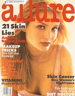
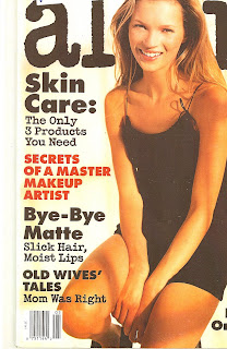
The covers I chose to analyze for 1994 have to deal with truth, lies, and fear. On the April 1994 cover there are headline that reads “ 21 Skin Lies and the Naked Truth” “Vitamins: Magic or Myth?” On the May cover there is “Skin Care: The Only 3 Products You Need” “Old Wives’ Tales: Mom Was Right” and “The Lowdown on Low-Fat Snacks.” Although these titles address different issues from skincare, diet, and supplements they all draw the reader in by claiming to dispel any myths, resolve controversy, and speak the truth. It is interesting that the magazine uses the tactic of telling reader’s that their thoughts and perceptions are most likely misinformed and by reading their magazine they will both uncover the truth and by extension become more beautiful.

The cover interpellates the reader by understanding and addressing some questions and curiosity of many women, both spoken and unspoken. For example, during the early 1990s we began to see low-fat, chemically-filled versions of our favorite foods cropping up all over our supermarkets. Allure capitalizes on this by claiming to give their readers the inside scoop on which ones to buy. On a deeper level, this still promotes the idea that if you are going to be eating, it should be low-fat because full-fat translates into a fat body, and a fat body isn’t a beautiful one. Also, in terms of vitamins, they were also gaining popularity during the early 1990s. Instead of addressing vitamins in terms of their nutritional and well-ness functions of health, they choose “magic or myth” connoting that the actual properties of vitamins may have the ability to magically rid women of some of their physically issues, thus making them more ‘beautiful.’ Humorously, you’ll probably need those vitamins because you’ll be robbed of the natural ones from all of the olestra and aspartame-filled, low-fat snacks you’re munching. Also, “Skin Care: The Only 3 Products You Need” is problematic. First, obviously they draw on the fact that readers ‘need’ certain skincare products, and by not purchasing or being aware of them the readers are not well informed and cannot be beautiful. They also touch upon frugality and being economically savvy by claiming that there are only 3 products women need. However, what they leave out is the purpose of the 3 items. Perhaps they are only 3 products women need to prevent eye wrinkles, or 3 products women need to prep their skin before applying their make up. The magazine draws the women in by claiming to simplify their regimen, however I bet the article gives many more examples of products than the cover claims. The more products they endorse, the more money the make. Finally, for the old-wives tale headline, the magazine hints at the fact that perhaps there is some truth to the wisdom of generations past, and that the newer the idea the better it is. What the cover doesn’t say is that the even though ‘mom was right’ there are now new and improved products that stem from these ideas for you to buy.The ‘fear factor’ tactic is also used in the headlines “Skin Cancer: One Women’s Nightmare” and “The Life and Death of a Diet Doctor.” Unlike the covers of Allure’s earliest issues, the magazine began to draw on women’s deep fears of diseases that wreak havoc on, and may be caused by achieving beauty. The problem is that skin cancer is a life-threatening disease that attacks the body and while a person should be concerned with healing and recovery, the term “woman’s nightmare” alludes to her battle with how it affects her beauty. Moreover, western cultures associate tan skin with beauty, yet tanning is proven to be one of the main causes of skin cancer. The double standard and mixed message of idolizing tanned skin and knowing that achieving this look is hazardous to one’s health further displays the inability and danger of emulating the ideal, yet Allure never addresses this. Finally, we associate diet with healthy, and doctor with knowledgeable, so when we read ‘death,’ ‘diet,’ and ‘doctor’ it is immediately both intriguing and scary that someone who may seem to be an expert on health could die. What the cover does not tell the reader is why and how the diet doctor died. Until we buy the magazine we won’t know. Perhaps it was something related to food, or it could be murder, and it was just a coincidence that he was a diet doctor. Allure understands the curiosity and banks on it.
Lastly, Kate Moss appears on the May cover lounging in a black slip dress with the text “A User’s Guide to Slip Dresses.” It is interesting that now, if Kate Moss or any other recognizable celebrity was on the cover, they would print their name and claim to have exclusive information pertaining to them gathered from an interview. However, as recently as fifteen years ago, the image on the magazine cover is used to sell an item within the magazine (the slip dress) rather than the magazine itself as a result of the celebrity pictured.

Allure Magazine 1991

Although Allure Magazine has a short, 18-year history, the premier issue and second issue covers look vastly different from the covers we are used to seeing today. In my analysis of the March 1991 and April 1991 issues I found four interesting themes for discussion; secrets, multicultural or ‘other’ women, allusion to plastic surgery.

“Secrets of a Makeup Artist” and “Secret Lives of Thin French Women” appear on the March and April covers, respectively. The notion that access to western hegemonic ideologies of beauty and thinness are both secretive and exclusive, and controlled by an elite few is actually constructed in the same way as the majority of our visual culture. Those with money and power control and distribute, while the masses internalize and accept, and can emulate and strive to embody. Additionally, by calling the information that both make up artists and French women possess are secrets that must be revealed or exploited to make the reader more beautiful displays our cultures obsession with private information and perhaps the precursor to magazines’ obsession with celebrity and covers reflecting that.

“Moscow Faces: Beauty Bulletin” and “L.A. Beauty: All Natural Artifice” are problematic headlines for various reasons. First, the term “Moscow Faces” has some disturbing connotations. The magazine groups an entire culture of eastern European women into “Moscow,” or a recognizable Russian city. The term “faces” shows that this group is not worthy of terms such as people, individual, women, or females. They are only as good or valuable as their face is pretty or beautiful. By detaching the face from the person and stereotyping hundreds of millions of women as “Moscow” completely objectifies and exploits them. Also, looking at Moscow from a historical and political perspective, the year 1991 was a short time after the dissolution of the Soviet Union and perhaps because not as much information was known about the women of these lands makes them more alluring, intriguing and ripe for commodification. The issues with “L.A. Beauty: All-Natural Artifice” stem from the idea that to be beautiful in L.A. is to be entirely composed of plastic. The word artifice denotes a clever trick or stratagem; a cunning, crafty device or expedient. With the beauty ideal being “all-natural,” this headline displays that yes, it is possible to look all-natural, but to do so, you must devise a deceptive plan (i.e. injectibles, plastic surgery) to achieve this look. In summary, according to Allure Magazine, all Moscow women all have the same desirable look, which can be emulated through specific make up techniques, and all women in L.A. look naturally beautiful because they have great plastic surgery.
In terms of the actual images or photographs of the women on the covers, they are very different than the ones we’re accustomed to today. First, on the March cover only five inches of the model’s face is shown, whereas today we generally see a recognizable celebrity, expensive clothing and jewelry, in an exotic location. In this image, we simply see the model with the ideal blue eyes, gazing upwards and outwards. The gaze is not toward the consumer, and does not attempt to draw in the reader through a direct gaze. Perhaps this gaze signifies striving, determination, attempts to achieve, or images with which our culture associates hope. Allure magazine understands a woman’s desire and struggle to be the ideal and by reading the magazine the woman is one step closer to achieving the ideal. Conversely, Allure uses a different tactic of interpellation through the sun-kissed, nude model with flowing blonde hair gazing seductively at the reader. Directly below her the text reads “Hair of the Moment” signifying that you too can be blonde, skinny, and sexy lounging on 600-thread count sheets by achieving the hair of the moment.

Sunday, December 13, 2009

1950s Suburban Role Model


Women’s roles in society went from the image of "Rosie The Riveter" to the suburban housewife. The Seventeen magazine covers portrayed women throughout the 1950’s as the new hope for society. Men returned home distressed from the war and women’s roles changed rapidly as they lost their previous jobs, the entire country wanted to return to a state of “normalcy”. What is interesting about the teen magazine covers is the young women are still portrayed as a demographic that plays an important role in shaping society. The covers directly hailed the young women, by making it seem as though the country needed their help, once again, in order to improve the state of life for all.

It is easy for us to look at this cover today and criticize it for encouraging women to live solely for their family and essentially subservient to men, but we must consider the time and place in order to understand why this image was being promoted. For one, the fear of communism was rapidly spreading and one of the major concepts was that the US was better , because it contained nuclear families something that was portrayed as missing from the Communist way of life. Images of these women in all aspects of the media made the idealized suburban family the definition of happiness during this time.

While the idea of women going to work during WWII seemed proper during those years, it was now seen as abnormal for women to leave the family everyday to go to work. Since women took over the male positions once the men went to war, the men needed those jobs back when they returned. The majority of the media publications are owned by men, which would explain why the images slanted more towards assisting the men get back their jobs and way of life , which they had before the war. These idealized images of suburban housewives are how the media images were slanted in order to help the men (media producers). Of course this was hidden beneath the glamorized images of women by making women feel as though they were actually actively helping the US recover.

The cover of this magazine is more about the daintiness and femininity of the female. She isn’t shown in a work environment or a bland colored suit. During the 50’s, fashion reflected the new feminine image by showing fuller dresses and skirts, brighter colors, and very small waistlines. Her outfit was no longer about practicality in the work force, but it became about how to look good for the husband and present oneself like the ideal housewife shown throughout the media. The cover of this magazine also interpolates the female reader by making her feel as though, fulfilling this image makes her a true American. Clearly the color scheme of her bright red coat and white gloves against the blue and white striped background, represent the image of the American flag.

Notice that the cover of this magazine doesn’t list the superficial headlines present on modern day magazines. The cover simply says “ Big ideals- and design… Its fashion and fun… its food and furniture… its hope- which is you”. The cover simply alludes to the fact that these broader subjects will be mentioned in the magazine. The magazine is still a source of entertainment for young girls, but it doesn’t just advertise the way in which a teen can change her body or look thinner. The magazine directly speaks to the reader by using the word "you", which is similar to the way advertisements hail consumers. Once again the use of the word ideals, means that the magazine is a source that teaches and shares ideas of the world with young girls. This looks at girls as an intelligent demographic, which should be aware of events taking place in the country.

The last line “ Its hope.. which is you” sums up the way the media promoted the 1950’s female image. Here the magazine is saying that this new female role in society is the one that can bring change to the United States. The young girl should idealize this way of life, because it is what allows the US to recover. Therefore women aren’t just acting subservient to men in society, but by acting this way they are able to contribute a lot of good. This makes women and young girls want this way of life, because it is glamorized and in away it is portrayed as an empowering image for women. The line that reads “about your own USA” makes it seems as though this new female role should be accepted, because it allows women to take control of their lives for the very first time. Of course this is debatable as of today and even soon after this image was promoted women began to question this way of life.

http://www.pbs.org/wgbh/amex/pill/peopleevents/index.html

http://www.seventeen.com/fun-stuff/special/65th-anniversary-cover-archive

http://www.isis.aust.com/iwd/stevens/50s60s.htm


Propaganda and Seventeen Magazine


World War II had ended, and in the March issue of 1946, the magazine was again promoting teen-age girls to get involved with the aftermath of the war. The images are more of young adults, most likely older then 17, but their beauty and confidence make them become admirable figures for young girls. Girls who used to read Seventeen magazine, and who currently read it, were usually under seventeen. Thus, the images become a way of idealizing an age that often becomes glamorized within the media. It is the age when you are supposed to have boyfriends, join the popular group in high school, and feel more independent.

While this image contains the basic attributes, which encourage young girls to idealize the female portrayal on this cover, it also acts as a propaganda poster. Once again this image hails the young girls reading the magazine, in order to get them involved with assisting soldiers who needed medical care after returning home from the war. This cover reminds me a lot of the propaganda poster of "Rosie The Riveter" which was to get women involved in working at the factories during the war. The woman are empowering in both images. Seventeen magazine focuses more on interpolating the viewer through the women’s beautiful and feminine appearance. The image of "Rosie The Riveter" represented a female who was embodying more masculine features, in terms of her stance and her clothing. Her hair is back with a bandana, and her arm is up as if she is showing off her muscles. Her facial expression doesn’t portray her as meek and subservient to men. Her head is held high as she raises one eyebrow, as if she is testing the power of the audience. She is also wearing a blue, men’s tailored shirt and her makeup is less obvious as in the other image in which the girl is wearing bright red lipstick. "Rosie the River" embodied attributes that were seen more masculine at the time.

Although this Seventeen magazine cover may not portray the women using commonly more masculine codes, she is still an empowering figure. We must consider the placement of this image. It was placed on the cover of a young girls magazine, so in order to still make it appealing to this demographic they had to use an image of a women that every young girl would look up to. In terms of what occurred after the war, these two images would meed to be quite different. When men went away to war, women took over many of the jobs previously occupied by the men. As soon as the men returned women no longer held those positions, but they were encouraged to help the soldiers deal with the aftermath, such as medical care. Yes, this may be a very patriarchal way of thinking about the use of women in society, but the fact is this is what occurred during the aftermath of the war. We must realize that the intention of this image wasn't to make young women feel subservient to men but encourage women to help out during a time they were really needed. Thus, the cover image wants to hail the teenager by playing off their insecurities and desires, while still attempting to create a propagandist image that persuades young girls the importance of helping the US recover.

This image is very beautiful, and a piece of work similar to many other propaganda posters. The color from her lips is picked from the color of the Red Cross symbol. Her eyes are bright blue, and the Seventeen writing is in another shade of blue. All of this produces the patriotic color scheme of red, white and blue. She is looking up at the distance as if she is destin for greater things. The image doesn't focus on what she is wearing, much like many other covers which showed the women wearing ornate dresses. The image is simply about uniting the country and including women of all age groups. The aesthetics of the cover are a big part of why this photo would have been effective in persuading young girls to go along with the dominant ideology of the time. This magazine cover seems to demonstrate how society at the time understood the value of young women. Today, it seems as though teenagers are viewed as more passive masses, who should simply think about more superficial things.


WWII cover image

Consciousness, Conscience, and the Cycle of Scandal

People Magazine is famous for spreading (and sometimes starting) scandal. One of the reasons it has survived since the 70s is because of its ability to provide a different side to great debates. By accepting exclusives from celebrities like Jennifer Lopez (who reportedly sold her baby pics for $6 million), People provides the means to control public image. Remember Marshall McLuhan's advice: "The medium is the message." People became the best method for public retribution.

In September of 1984, our beloved fashionista, Vanessa Williams, was dealing with the first pornography scandal in People magazine history. She was actually Miss America at the time and was forced to step down in light of some nude (and suggestively lesbian) photos being published in Penthouse. Beauty queens are supposed to be models of female perfection, but Williams fell short of this role.

What's most interesting is that People didn't immediately shun Williams like many tabloids do. Instead, they allowed her to tell her story of naivete, vulnerability, and double consciousness. The second of two stories covers the fall of the first black Miss America who was given a role of signification that was beyond her power, both in being victimized as a young woman in the hands of a shady photographer, and also in the hands of the general public as a symbol of "blackness" gone wrong.

Still People was able to reconstitute William's personage by projecting an entirely better one, one in line with the way the public had already seen her in her crown. She was (and still is) a ravishing beauty who is both stunning and rather quirky and inviting. On the first cover she is more sexually attractive, but the second shows another side of Vanessa. She is smiling and happy and affable. This is what makes a lasting pageant queen.


It may be said that these stories saved Williams, as she is still recognized in register as Miss Universe 1984 despite stepping down and has gone on to have a very successful career in music, television, and movies. This "dirty girl" has even appeared in advertisements for products associated with cleanliness and wholesomenesss like L'Oreal, Crest, and Proactiv. She even did a promo for California highlighting Disneyland in a Visit UK ad.

Saturday, December 12, 2009

The War and The Importance of the Seventeen year old


Close to end of WWII the magazine encouraged young girls to be supportive of the war. The dominant power within a hegemonic structure is often able to rule with consent by creating a general common sense for the public. Without thinking about the consequences of the war, these girls immediately believed in the dominant ideology concerning the war. The covers interpolated the reader (teenage girls) by telling them that they could do something important in society, which was empowering to young girls who had never been given this chance before.

In one cover they presented a letter, which “hailed” the reader to get involved with the war, by purchasing war bonds to help finance the war. The book Practices of Looking states:

“ The ideological function of many adverisitements takes the form of speaking a language of patriotism and nationalism in order to equate the act of purchasing a product with the practices of citizenship”(277).

By purchasing a war bond American’s demonstrated national support and pride for their country. This same idea is seen in modern day advertisements, but here is a classic example of how this magazine not only promotes the dominant ideology of the society at the time, but it hails the reader by making them feel part of a group, in this case part of the U.S. A young girl would feel empowered and convinced to support the war after seeing images like this one, which directly speak to them. Just as advertisements speak to male and female insecurities, here the cover acts as an advertisement for the war and speaks to the teen-agers insecurities of feeling insignificant.

To me this is a great way to build confidence in young girls and encourage them to feel as though they can be active participants in society. It also teaches girls about current events which is one major aspect missing from today’s teen magazines. Most girls reading Seventeen magazine today, probably don't know anything about the Iraq war or any other major event. This tells them they have choices to make which are important for the well being of society, and they have the abilities to contribute to the bigger picture. It doesn’t treat them as if they are too young to understand the war. The cover essentially becomes war propaganda by presenting a letter which was sent to these girls, their parents and every other demographic in society in order to gain support for the war. Teen-age girls are just as important as anyone else and they should understand their social responsibilities in society.

http://www.seventeen.com/fun-stuff/special/65th-anniversary-cover-archive


Seventeen Magazine was born!

In the 1940s, different industries began to view the teenager as a dominant force in shaping pop culture. Companies started to market products towards teenagers and the teen magazine was born. Society was also changing rapidly and no one was addressing the next generation of women who needed to better understand the changing roles of women and their active participation in the prominent events occurring. Very soon after The Teen Bill of Rights was published, Seventeen magazine was created. The Teen Bill of Rights basically stated the social responsibilities teens should have and what they represent for the future of America.

During its’ earlier years, the magazine seem to be a positive source of media which helped shape young teenage girls into important aspects of society. The covers on Seventeen magazine used to promote more admirable causes. The magazine covers didn’t just represent ways in how to change one’s physical appearance, but they promoted a female role model for young girls to emulate. Each cover seemed to promote an acceptable female lifestyle, which usually encouraged young girls to play an active role in society, while still promoting the dominant ideologies of that time period. Seventeen magazine covers have demonstrated a digression by encouraging girls to currently be more passive participants in society rather then active ones.

The very first issue of Seventeen magazine presents a non-threatening looking teen-age girl, who you could imagine many young girls looking up to. The very first cover, demonstrates the common theme of presenting an image of a teen-age girl, whom every young girl wants to be and every boy wants to be with her.

The cover does not contain headlines all over it, but it simply says at the bottom “Young fashion and beauty, movies and music, ideas and people”. The use of the word “ideas” encourages a more active role for the reader. It doesn’t advertise ways to loose weight, or clothing to make you look skinner. While the magazine itself may have contained some of these concepts, the cover promoted something that was more superior than today’s Seventeen magazine covers. There is also an artistic side to the cover of the magazine. It isn’t about what it says, but the beauty of the young girl, the artistic numbers, and the palet of beautiful pastel colors. Why have we lost this artistic aspect of fashion/teen magazine covers? Every detail of this cover is geared towards targeting teen age girls from the use of the color pink, to the flowers on the numbers.

Below is the intended purpose of the magazine stated by the first editor Helen Valentine, in 1944.

"Seventeen is your magazine, High School Girls of America — all yours! It is interested only in you — and in everything that concerns, excites, annoys, pleases, or perplexes you.

You're going to have to run this show — so the sooner you start thinking about it, the better. In a world that is changing as quickly and profoundly as ours is, we hope to provide a clearinghouse for your ideas.

As a magazine, we shall discuss all the things you consider important — with plenty of help from you, please. Write us about anything or everything. Say you agree with Seventeen or disagree violently, say we're tops, say we're terrible, say anything you please — but say it!"

http://www.seventeen.com/fun-stuff/special/65th-anniversary-cover-archive#ixzz0ZRzGEjX2


Thursday, December 10, 2009

Shape in the Present


In this period of time, the people in the cover look less covered. The magazine starts shying away from only exercise-related headlines. Still the headlines have the same font and color. The people embracing the covers now mostly wear bathing suits. the covers are now more colorful. Lastly, there is more focus now on health rather than just aerobics and physical activity. As the new millennium begins, there are different colors in the scheme of the magazine and the magazine talks more about woman's health. Now, also, we can see that the personal life and fitness of the celebrities that are in the cover are integrated to their presence there. There are also different size and colors and a bigger focus on health than just exercise. Presently, we can see that the focus is more on how things can be done quicker. The aim is to get faster results.

Shape's Beginnings


We can see during this period of time that the people embracing the covers of this magazine are celebrities. From the lack of information or mention about the celebrities it can assumed that the purpose of these celebrities is just to model their fit figures. Also, all the focus in the headlines are on exercise, fitness, and diets. The clothing used by them covers their whole body. As we saw with the beginning covers of Cosmopolitan Magazine, the headlines in shape's beginning issues have the same font and color, without adding any importance to a specific article. The photo shoots for these covers take place in outdoors mostly.

Tuesday, December 8, 2009

Vogue 1988-Present, Fashion to You

Since she obtained the title as editor-in-chief in 1988, Anna Wintour has encountered both positive and negative feedback.  While she has been acknowledged as the reason for Vogue magazine’s revamping after years and years of what were called the “beige years” under Grace Mirabella, others argue that Ms. Wintour has a very hegemonic view that is consistently represented through the magazine’s issues. 

In a recent article on Mediaite, Ruthie Friedlander analyzes the four most recent Vogue covers, stating, “someone in the office likes blondes”.  She is referring to the fact that the four covers have simultaneously displayed blonde women—“ September was Charlize Theron, October Michelle Williams, November's cover featured the stars of the upcoming movie Nine, half of which are blondes, and this month, a platinum Cate Blanchett reigns as cover girl”.  It is apparent that the magazine has being promoting a certain type of woman for the past few months.  All of these women are white, blonde, thin and youthful.

However it can also be argued that Anna Wintour brought a new worldview to the fashion industry that was new and innovative.  The initial covers produced under her power are known for being shot outside of the studio in a natural environment.  The women on the covers were placed in beautiful scenic backdrops that brought more detail and light to the images.  Ms. Wintour brought more of a variety to the covers with the use of space.  The covers had more variety in the location of the photographs, the women’s poses, styles, etc. 

In regards to the use of text on the covers, it began to have more of a focus, increasing in text size and positioning on the page.  While text was apparent from time to time on the Vogue covers in the past it was strategically placed on the sides of the page as to not interfere with the image of the woman on the cover.  However this was not the same after 1988.  Text began to appear in the center of the page in different fonts, colors and sizes.  While it did not take away from the image of the woman, it became more of a focus, something to take notice of.  At the same time, the text focused mainly, if not always on the latest fashion trends, “rock fame fashion” (December, 1992), “The best of a great new season” (September, 1992), “Winters great wearables” (November, 1991), “Spring collections, 132 fashion and beauty looks straight from the catwalks” (February, 1991).  The magazine still placed most of its focus on the analysis and discussion of fashion styles and trends.  The word “You” didn’t really have a place on the covers until the mid 1990s.  Prior to this, the viewer was not directly addressed. 

 Vogue - Bonnie Berman - January, 1991

January, 1991

Vogue - November, 1991

November, 1991

Vogue - Kate Moss - January, 1995

January, 1995 (A clear presence of the word "You")

Sunday, December 6, 2009

Vogue for the "Real" Woman

            Following Diana Vreeland in 1971, Grace Mirabella became editor-in-chief at Vogue magazine.  Her goal was to change the magazine’s target audience and focus more on “real” women.  She quickly moved away from the fantastical fairytale like images Vreeland constructed, concentrating on more practical clothing that working women would find useful.  For this reason, the women on the covers of Vogue magazine seemed very similar in attire and stance.  In many of the covers, the women are wearing little make-up, their hair is usually down or done with little effort, and their clothing has little to no detail, usually lacking patterns or designs or any sort.  In addition, all of the women are staring straight ahead at the camera.  The backgrounds of the covers are solid colors, on many occasions white plain backgrounds. Vogue USA 1974 APR :       Vogue USA 1974 JUN :       Vogue USA 1975 NOV :       Vogue USA 1975 MAY :       Vogue USA 1977 MAR :

            What is interesting about the covers under Mirabella’s influence was the increase in text.  It is possible that this change has to do with the fact that the magazine changed from a biweekly magazine to a monthly magazine during her time as editor-in-chief.  Because there is a larger time gap between the magazines, there is more to promote on the covers and to address within the magazine.  The text discussed ways to enhance one’s beauty.  The magazine had evolved from just a woman’s guide for what to wear.  It quickly began to serve as a guide for women’s health and beauty.  It no longer was just about clothing, it was about the woman as a whole.  In addition, expenses were taken into account and bargain shopping came into focus.  Women were now being informed on the best shopping deals.  Fashion no was no longer for the upper class, stay-home women.  

The Introduction of the "Exotic" Other


Diana Vreeland, who was editor-in chief of Vogue magazine from 1963 to 1971, was believed to be essential in the changes and transformations within the fashion industry.  People described her as having an “ornate and overbearing style that she has imposed on the magazine” (Angeletti and Oliva, p.204).  Her enthusiasm for extravagance and “dress-up fantasy” came with mixed feelings.  Some argued that her taste and new styles and trends were polluting the magazine with unappealing and unrealistic images.  However at the same time, Vreeland became editor-in-chief during what was known as the youth-quake and sexual revolution, in which individuals were breaking away from the traditions of the older generations. 

            Vreeland’s extravagance and fantastical vision is very apparent in the Vogue Covers with which she was responsible for.  She continuously attempted to represent a type of environment and women that were considered exotic and extraordinary either shooting the stories in “exotic” locations or dressing the models in “exotic” clothing.  As Sturken and Cartwright discuss in Practices of Looking, Vreeland attempted to transport the readers of Vogue to “an unidentified exotic locale” (Sturken and Cartwright, p.112).  Color and various patterns were a constant in all of Vreeland’s covers for Vogue magazine. 

            In the four covers I have attached to this post, excess appears to be a common theme throughout.  Whether it’s fur, jewelry, makeup, hats or all of the above, Vreeland always went for more.   In addition, the covers still seemed to focus more on the image of the woman rather than text.  In many of the covers there is little if any text other than the cover title.  The images focus mainly on the face or faces of the models.  While the images are filled with color and various textures, they still only consisted of headshots, showing little below the neck or in the background. 

Vogue: A Guide for Women

May, 1929

March, 1929
October, 1929

            Under the editor-in-chief, Edna Woolman Chase, from 1914 to 1951, Vogue Magazine underwent many changes.  As a result of World War I, many women were urged to enter the workplace.  Thus women were making their own money and had the freedom to spend it any which way.  The new female consumer provided magazines such as Vogue with a new audience.  This gave way to the avant-garde culture in which the reader was educated on superior tastes within fashion and the cutting-edge styles.  Women were encouraged to shop, but to shop for particular things, hence Vogue magazine operated as a guide for readers, helping them purchase the “right” things.

            This transition was very apparent in the Vogue covers of the 1920s where the illustrations of women supported a more “free” and career driven individual.  This was believed to be represented in the one of many fashion evolutions, in particular with the transition in the female’s hat.  The cloche hat was more of a practical hat that allowed women to do more, and see more.  This style hat is present in over more than half of the Vogue covers during the 1920s.   In particular, I was interested in the October, March and May covers from 1929.  The illustrations capture a woman in the middle of a certain action, walking down the street, driving a car, and talking on the phone.  While the tasks can be regarded as insignificant, the representations of women illustrate a move towards independence. 


Tuesday, December 1, 2009

Social Connections and the Commodity of the Celebrity

As a women's magazine, People intends to address the issues important to the "fairer sex". You can see in the beginning that People was less interested in being scandalous than wanting to provide a service to its readership, a good quality read. Of course, that started to change in the 80s when the juicy details of the glamorous life came in high demand. People had begun to establish itself as a leading resource into the lives of the rich and the famous, but with a different sort of twist than we see today. They were set up more like human interest pieces, exploring the intimate lives of the inaccessible.

Unlike fashion magazines, People decided to commodify images, not just faces. When the occasional model did grace its covers during the first 20 years, we only heard about them at a personal level. They were not shot in artistically posed shoots with outstanding hair and makeup. Instead People recast these beautiful women as human beings.

The best way to do this was to place them in normal social situations. All three of the models that appeared on the covers of People Magazine during the 70s had headlines talking about their relationships with boyfriends:

Hutton - May 12, 1975

Bergen - July 28, 1975

Teagues - June 19, 1978


In this way, the magazine was able to effectively mold the public image of these women and the public image of women in general. These are the women everyone was to look up to, the epitome of beauty and happiness. This is what you should strive to be.